

MisterBull
-
Posts
58 -
Joined
-
Last visited
-
Days Won
1
Content Type
Profiles
Forums
Blogs
Articles
Rules
Downloads
Gallery
Store
Everything posted by MisterBull
-
Earlier this week I posted an incomplete version of this image to the forums gallery requesting opinions. This is the completed penciled sketch of this piece and I finally labelled it "The Meeting at the Crystal Fountain". I've considered writing a short simple story to go with it, but that's just an idea I'm toying with atm. The work itself is not actually finished, however; I still intend to paint it digitally and then transfer it into a 3D image [something I've done before with recent pony artwork, ask if you'd like to see the older examples] I also considered doing an illaborate clay sculpted frame for this image complete with a detailed paint job (to make it look antique-ish). If I do, I'll use this thread to showcase the work in progress. I would had posted it again to the gallery, but I felt it was a bit too soon, and I might risk looking like a spammer if I did so... so I decided to post it here [despite how inactive it usually seems here] So, what do you guys think so far?
-

Princess Cadence & Shining Armor - Untitled Piece [also unfinished]
MisterBull commented on MisterBull's gallery image in Canterlot Community Art
![Princess Cadence & Shining Armor - Untitled Piece [also unfinished]](//content.invisioncic.com/r257793/gallery/album_599/sml_gallery_791_599_797814.png) actually, no, that's more like 20 hours xD to do all that in 8 hours WOULD be mental suicide!
actually, no, that's more like 20 hours xD to do all that in 8 hours WOULD be mental suicide! -
MisterBull's Master Gallery
Images added to a gallery album owned by MisterBull in Canterlot Community Art
Here, I'll post my best pony related artwork -
-
Princess Cadence & Shining Armor - Untitled Piece [also unfinished]
MisterBull posted a gallery image in Canterlot Community Art
From the album: MisterBull's Master Gallery
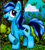
I decided to go ahead and post this unfinished b/w penciled image to get some early opinions. I'll go ahead and critique myself on Shining Armor... he doesnt look at all like the show version of himself [admittedly this is kinda on purpose ] and he seems somehow a bit off... not sure why at this point... may be his neck, which makes him look like a llama or something. Setting: They are inside a large cavernous setting with Greek style structures, Though it doesnt show up very well in the scan here there is a huge opening looking out at what appears to be a large castle-like city on a mountain (inspired from an image I saw recently of the Elysian Fields of Greek Myth) Princess Cadence and Shining Armor here are supposed to be on a sort of royal holiday vacation (thought about making it their honeymoon or something, but later had second thoughts) Once I'm finished touching up on the pencil work here, I'll go ahead and colour it digitally. This is also one of my future 3D pony projects [more on that later, if your not at all familiar with it] Everything's done by hand, including the decorative border [sketched in pencil and done over with a basic ink pen to darken it] Started working on it at 4 am, its now 12 am the next morning and my wrists really frickin' hurt! xP -
Game: Spikes Quest video update: Graphics Showcase#1
MisterBull replied to MisterBull's topic in Creativity
Graphics like those obstructions will probably be used for in-between areas, where there would be no enemies or platforming... though maybe a puzzle or sometnhing as suggested in the Youtube comment section of this video. lol, well that is my goal ^_^ Many thanks! -
This video is just to showcase a tileset for Spikes Quest the graphical theme here is called 'The Lost Shrine' let me know what y'all think
-
Oh, well in that case, I'm sorry I even tried... [content removed] To Artax, sorry I didnt think to do the PM thing, it might have made me look like a total idiot for bringing the issue to the public eye. I simply just wasnt thinking correctly in this regard.
-
I submitted a comic strip of my new OC pony webcomic days ago, but its never seen the light of day in the gallery. I'm not sure if the gallery updates are just super slow, or if my work was rejected for some silly reason... So that's why I'm posting this thread, as a question regarding the status of that art submission. as a note, I posted it twice. the first time I submitted it, I missed the notice that its pending for moderation approval and I thought it just didnt go through. Got the message after the second attempt which made me literally say "Oops!" sorry 'bout that!
-
That's a thought! I'll have to experiment. I'm sure that there's crafting sealant out there that may work on vinyl. thanks for the suggestion!
-
From the Ponychan thread: My response: nuff said. I'm calling it a nigh- erm, morning c_c
-
Alright, so I got a bit impatient, but the glue has completely dried and now I can have a better look at the book as it is now... coverings and all (minus the decorative bits) This is the part where I ask everypony for opinions. Should I keep working on this project or scrap it and start fresh and anew? In my honest opinion, even though some of my earlier fears were proven wrong, I'm still seeing other flaws that can and may have already ruined the project for me. Please observe the image and read the descriptions I post here to understand why I feel that way... > #1 Here you see the fully bound book sitting right next to an age old classic. This is somewhat for comparison to another book, but its also my chance to show off a book from my own personal collection. I totally recommend Felix Salten's Bambi as a good bedtime read! but I'm getting a bit off topic here... c_c > #2 okay, first issue. No matter how hard I try, I cant seem to keep the pages nice and flush. this is a shot of the side edge where the paper seems to jut out a bit crookedly. I could try sanding it down, but I fear that if I keep sanding away at this that the book would just become a warped mess... > #3 And here, for some reason the cover looks a bit fat. I've pressed it between my fingers a few times, but it still retains that random mass... It may be how it was glued or something. Its not warped, in fact the book is pretty solid. Its just this middle part that looks a bit odd... > #4 And here we can see that the vinyl became wrinkled for some reason. This might have happened while I was working the winged edges around the cover board. Honestly, I dont really know how this can be fixed. > #5 And in the final image, I present the smallest and possibly the most insignificant of errors. The ribbon is too loose. Maybe its not such a problem, but the ribbon should probably stay centered. Perhaps I should had did a bit of head banding to fix that before gluing the book together. But I'm not yet any good at doing such thread work. (lol, bad excuses) there are a few other problems that I could not fit into this image without it getting ridiculously too big for my liking. one of those problems has to do with the emboss work becoming a bit smoothed out and faded towards the books spine. The other has to do with the end pages being a bit roughed up from earlier sanding. From all these things, I think I've learned a few simple lessons that I can certainly use on the next attempt. But for now, I really need to decide just what the heck I need to do with this one. I certainly don't think its e-bay worthy in its current state (yes, I want to make and sell these things...) . Perhaps if I later added in the finished decorations that maybe it would even out, but I seriously have my doubts. I'd really like to hear some opinions on this...
-
lol, well I'm glad that someone likes it
-
Here you see the book completely glued together. I'm letting the glue dry over night so to avoid completely screwing it all up. Of course, I'm having doubts on the stability of the project atm. Despite having measured everything to a T I'm discovering a few annoying flaws and one major flaw that could totally make this project go kaput. The smaller issues are ones that probably can pass as noticeable blemishes. first little flaw that I noticed was that sometimes during the process of gluing the cover material to the boards, it apparently slid a couple of fragments of a centimeter making it slightly out of line which makes folding the winged edges over the cover board a bit crooked and whatnot. the second slight error is that because the cover material is a bit off, one of the books corners has this nasty exposed spot. I may have to purchase some brass book corners to cover that up The one major error was discovered when I started gluing the end pages to the boards. When I try to close the book, the paper's edge wants to slide up the board, and when I try to open it, it wants to slide back down. This means that I may have made an incorrect measurement on the spine. I'm hoping that by tomorrow when the glue is all good and dried that this wont be such a problem. But if it is, then... well... this project is as good as ruined. I'd have to start right back at square one, and that will ultimately suck...
-
Bad idea with the markers. After feeling I might have overdone the antiquing I found out that all the marker can very easily be wiped away with a damp napkin. The cover is completely spotless of marker as I type this. Not sure whether or not to feel good about this or not. Sure, its good news in that when I totally mess up I can wipe it away. But its bad news in that the desired effect wont so easily last. What if the user of the journal got caught in a rain storm and upon getting home they try to dry it up a bit? Yeah, you get my point... c.c I'll just have to either figure out another way to go about it or just skip the antiquing bit entirely. Meh... I'm going back to bed. I'll just sleep on the thought. No pic, as there's not really anything to show.
-
The emboss work is finished and I successfully glued and applied it to the boards (I had to take it off and reapply it a few times which unfortunately cost me just about all my glue, but its done!) Atm, I'm just doing a bit of antiquing, by applying a bit of gray colored marker and smearing it around with my finger. When its done, I feel it'll start to resemble that of an old book. Oh, and I should add, when I fold those winged edges over the boards it gives me an idea of the cover's thickness... this cover is darn thick!
-
Feeling somewhat burned out on the inner cover designs I decided to turn my attention back to the main outer cover material. I measured out and cut the vinyl (yes, that's what I'm using). did some more measurements and a bit more cutting and now I'm working on the embossing. The tutorial I learned this technique from said to first spread glue over the cover before laying out the fabric. But I'm a bit nervous about the glue drying too quickly on me so I'm just getting the embossing out of the way. When I'm ready to glue it all together I could just rub everything into place when I'm ready
-
The bottom panel is finished! I'll let you guys decipher the writing yourself using this Equestrian letter sheet here: As an added feature to the journal I'll also include a Tolkien-ish letter sheet on the very last page of the journal. Something like this:
-
I seem to have misplaced my silver gel pen, so for Celestia I decided to try using the gold one. Bad choice. She now looks like Alicorn Fluttershy. If ever I find my silver pen before the completion of this project I'll try making corrections. Until then Alicorn Fluttershy dethrones Celestia as the sun goddess. Oh, did I ever mention my webcam takes damn good closeup images?
- 37 replies
-
- 1
-

-
- bookbinding
- journals
- (and 2 more)
-
well, to be honest, this is my third go at it. The first two attempts came out terribly warped but I blame that on the poor choice of glue. As they say, you learn as you go
-
weight? I'm not totally sure off hand. The majority of the bulk is just regular computer paper but the end pages are a bit more thicker like card paper (I think it was resume paper or something like that) If your wanting the overall weight of the book, I'll have to see about weighing it to check for ya. though I dont have any proper scales on hand atm
-
lol, actually such manuscripts are what inspired me into looking at bookbinding in general. I love old ornate books that house important or cryptic documents
-
It'll be whatever the user wants it to be I plan to make these and maybe sell them on e-bay (if there's a good demand for them) if that fails, I may just use this as a journal for recording dreams or something
-
Taking a break for today. Just pigging out on some junk food and watching LP videos. I at least deserve one free day a week, don't I? I'm still open to ideas for the quote that I am to use for that bottom panel. It doesn't have to be entirely show centric (I just need something thoughtful, like what you'd normally see written on the cover of your standard 'feel good' journal) I know this thread is generally dead if not for my continual activity with this thing. But I'd like to hear a comment or an opinion every now and then, so please feel free to give me your input about the project so far thanks in advance!
-
I've tried getting a good screenshot of this but the limited light in my living room made it kinda difficult. Oh well, this will do for now The frame design for the inner front cover is almost finished as you may can tell. This is the result of several hours of sketching and then inking with the gel pens. I'm rather proud of how it came out. I just need to fill in those last two blanks. I'm thinking for the top one I'll do a tapestry style illustration of Celestia and Luna on both sides of the sun/moon with a bit of decor around it. For the bottom, I'd like to write some meaningful quote in Equestrian style alphabet. Anyone got any good ideas for a quote?
-
Sweet Celestia, gel pens are fricken' awesome! Facts to be, I'm kinda having second thoughts about the emboss work on this piece and instead just continue doing this sort of design all the way around it. c_c

![Princess Cadence & Shining Armor - Untitled Piece [also unfinished]](http://content.invisioncic.com/r257793/gallery/album_599/sml_gallery_791_599_797814.png)
