


Nite Frite the Scare Mare
-
Posts
59 -
Joined
-
Last visited
Content Type
Profiles
Forums
Blogs
Articles
Rules
Downloads
Gallery
Store
Image Comments posted by Nite Frite the Scare Mare
-
-
I'm glad she's a chicken and not a cockatrice
-
My Anarchistic rocker friend has hair just like that, but isn't quite as adorable for some reason. Very nice

-
Very nice! There need to be more griffen OCs.
-
Never come between a hungry female and her baked treats. Never.
-
The back legs are a little off, but the hair and face are spot on! Does his mark mean he's a doctor of some sort?
-
Curious. Is she a zebra/pegasis cross or just a pony with a two-tone coat? Either way I like the desighn!
-
so this it what she looks like! Nicley done
-
Nice work. I wish I could sketch that well.
-
I love Nightmare Moo! Brilliant ideas all around! Bravo!
-
Reminds me of Wierd Al for some reason... I love Wierd Al, ergo I love this!
-
Congratulations, this is now my new most favorate thing in the world!
-
Looking good, mang. Now that I look at them, the necks seem a bit short, but I always have problems with necks, so you might want another opinion.
I shall bear that in mind, thanks
-
How curious! An amalgam of vulpine, avian and equine features with the abilities of a ninja. Cirtaintly one of the most unusual ponies have seen.
-
I think the Ram should be smiling!
But he's an angry goat! (he's probably angery because he looks like a ram)
-
And it looks like the basic technique is there. I can see where some deliberate choices were made to keep the lines clean, like sticking to 1:1 and 2:1 angles on the horn. Cleanliness is the strong point on these. Where they could improve, I'd say, is the general shape of the pony itself, which people havebeen pointing out. The limbs seem a touch thick, and the nose seems a bit too round and downturned. Find a good side reference and compare.Twi's forelocks look pretty good. The tail's overall shape is good, but its color streak curves differently from the tail, which makes it appear flatter than it could.The chest up front might stand to have some more volume, and as much as a straight line looks good on the pixel level, the belly beneath should have some curve. I find on organic forms, straight lines are TOO clean.The horn, to me, is the thing that seems most off. Perhaps if you use a 2:1 line on the underside and a 1:1 on the top side (essentially, flipping it on the diagonal axis), it would seem more right. As it is now, it pokes a bit too FORWARD when it should be poking more UPWARD.The Cutie Mark is nice and representational, as it should be. I agree with the choice of making it bigger in proportion here. The difficulty here is that Twi's colors don't quite contrast enough to make all of the details clear. Contrast is very important in pixel art. Try cheating the colors a bit. Experiment with pulling some saturation from the pink star, or giving it more. Brightness might do the trick too. Remember that pixels are about playing impressions upon the eye, not about strict adherence to color or form. As long as the colors are close enough, peoples' brains will tend to push them toward the familiar. Recognizable is as good as accurate in many cases.Finally, her lower eyelashes. Given the potency of pure black as a color, those 3 dots tend to pull toward each other and look more like one long diagonal rather than 3 seperate forms. Eyelashes tend to give me trouble too, but usually there's a solution. you might try spacing the lashes a bit more (which may not be accurate to twilight's FORM but gives a better IMPRESSION), or you might try adding some midtone (between black and lavender) dots between the eyelashes and the eye to pull that line toward the eye. The simplest solution would be to just give her 2 eyelashes instead of 3, but I think 3 should be possible with enough tinkering.
Wow, that's alot of information! Thank you very much for taking the time to analyse this so thoroughly Dessa, I realy appriciate it. I will be sure to implement what changes I can from all of your advice. I'll do some more work on them with some help from crp_dude and they should hopefully be up to snuff. Thanks again
-
You've got a knack for manes. Those little intricate curves and lines tend to trip most folks up when it comes to pixels, but you seem to get the picture.The 2 things I notice here1. Fluttershy has no wings.2. Dashie's wings are a bit busy. You might try working more with the contours and less with the inner lines here, or using suggestive lines. Some great examples of way to handle fidgety little details WITHIN a contour can be found in the pokemon games. I learned a TON by studying those sprites.
Thank you very much for the advice there dessa, I will be sure to have a look at the pokemon sprites. Most of my sprites were Sonic inspired. I will do shading when the animation takes place with the legs away from the screen being darker. I was a bit stupid forgetting Fluttershy's wings there, But I assure you that she wil have them in the finished product
-
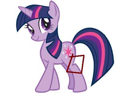
This is really cute! I love Twilight, she is always cute.But... the legs. The forelegs look a tad thick at thick ends (at about the ankle) and the rear legs are missing the.... ARGH! the bit where the leg looks like there is a chunk missing. screw this HERE is what I am talking about.The fringe's curve is a bit more even than you have it. Just cause you asked.
Hey, thanks for the feedback, it is much appriciated! I can see what you're saying about the chunky legs and the backwards knee thingy. I was planning for it to be more prominent when the pony was walking around, but when compared to that picture it does seem a little too reduced. I'll see if I can improve upon it. There is aways room for imporvment.
-
This is great. Love the octopus or squid tenticles at the bottom there. Cephalopods rock!
-
This made my eavening! Wonderfull job

-
Dime-a-dozen back-stabing scum-bags! Nice pic
-
Curious, but I like it
-
That is a fantastic helmet! I don't know what this guy was created for but i love it!!


![More information about "DJ 8tomix [origional/unedited/uncolored]"](http://content.invisioncic.com/r257793/gallery/album_321/sml_gallery_3038_321_2882586.png)


Stop right there criminal scum!
in Canterlot Community Art
Posted
oh yes!